Sunday, April 29, 2012

Full Spectrum Watercolor Words

Over at Simon Says Stamp this week, the challenge was show us your favorite word. Because I've had a lot of time on my hands, I thought about this for a while. But in the end, it comes back to the truths we know. There is nothing I would rather do than


Laughter to me is full of color, life, and spirit, so I decided to use my new Dylusions dye inks as a medium. Because my new friend Marjie Kemper blogged about filling water pens with the inks , I thought, hmmm, since I don't have that many water brushes, why not just spray some into a palette and paint from there? Which is exactly what I did. What amazingly LUSCIOUS colors.


Here's the low down on how I made the piece. The base is watercolor paper which I sprayed with purple and pink Dylusions Ink, and then dry brushed over that with white acrylic paint. Some of the inks reacted, some didn't; I was fine with that. I bounced some white and black paint over it for interest. I folded it like an accordion card. The cactus looking things, the girl parts, and the border were all painted on cover stock and adhered to grunge paper for support before I cut them out. The letters are grunge board, covered with two coats of picket fence stains, and then covered with a pink copic marker, edged in black. Once that was dry (or almost) I used some Stardust Stickles on top for the glitz. (I tried out a gazillion different ways of doing the letters and probably would just paint them white the next time with acrylic before adding color, but by that point I didn't have the right letters left any more).

I used a Fiskars postage stamp punch on black paper, and added the white dots with an opaque pencil for interest. I put the pink letters on that, and then mounted the whole thing on mini Popsicle sticks, which I had covered in black marker. There are slits in the back section of the base, into which I pushed the Popsicle stick.


I was really happy with the way this turned out and can see making more with different words. I want to futz around with the accordion fold because I would have liked the layers a little closer I think, but I was running out of time. And the second time I do something is always better anyway. I just wish someone had told me in high school that I really should pay attention to algebra and geometry!! Angles and dangles are definitely a hit and miss thing with me.

Another of my favorite places is Inspiration Emporium and their challenge this month is watercolors. I'm thinking this qualifies - I used them with water, mixed, and painted, so I'm posting there too. If I'm off the mark there, please forgive me.

Enjoy a laugh today!!

Thursday, April 26, 2012

April or 4th Tag of 12

Ah, procrastination. Gotta love it. Here's my tag for Tim Holtz's 12 Tags of 2012 - April. I didn't have the die, so I used the elegant flourish and the bird from the caged bird die cut. Somewhere along the way I forgot to color his little wing, and when I went back to do it, I couldn't get the colors remotely close. Oops. No wing for my birdee. Oh well, the crown probably keeps him from flying!


Although I can't believe I'm actually going to say this out loud, because I'm sure it will put a giant jinx on things, I'm feeling pretty comfortable with blending inks after completing Creative Chemistry. Now, colors on ribbons, that's another thing. But I think yes, it's about the layers. I started with Scattered Straw, added some Wild Honey, and then finished up with Tea Dye Stain. I actually used a fair amount of Tea Dye Distress Ink on the tag too, and it was like finding a  new color...which I already owned. I added some music and a flower just cause I thought such a regal birdee would be singing in a garden. That, and I thought it was a bit empty on the bottom.

Wednesday, April 25, 2012

Old, Cool, Patina-ed, Pasadena Stuff

On my last little adventure I took a mobile workshop through Old Pasadena, a part of Los Angeles, California. In the Planning World (my day job) convention mobile workshops take you to parts of the host city, with tour guides no less, to tell you all the innovative and good work they are doing. Mobile workshops are the bomb, and quite a bit different than staffing public meetings.

Old Pasadena is a 22 block National Historic District run by a non-profit organization that manages the District. It was beautiful. Lots of bricks, beautiful alleys, re-furbished buildings, etc. I ended up with a couple really cool pictures that I want to put in an album, so I thought Linda Ledbetter's Compendium of Curiosities 2 Challenge featuring Mr. Holtz's Faux Patina method (succinctly described on page 58) was the perfect match up. I've done this before, but for some reason liked the result better this time. More layers this time I think.


(Quick edit the next day: something kept nagging at me last night, and it was the fact it looked too sterile. This morning I added some Black Soot Distress ink to the ticket edges and the bricks and am much happier).


I want to mention two bloggers who were quite inspirational this week. Candy Colwell, over at Simon Says Stamp made the coolest frame for their word challenge this week. She made filmstrip reels out of of gears and dowels, which just blew me away. So I know that's why I started thinking filmstrip for this piece. And Margie Kempler's piece for this week's CCC2 is fabulous...the colors, and the little ticket she included. Do go check out her blog, because it will take you some pretty fun, interesting, and beautiful places.

To get back to my piece, I used Distress paper and embossed it with the brick embossing folder, sanded it and then applied a bit of Aged Mahogany Distress Ink here and there. From more distress paper, I die cut the film strip, sanded that and added some Pumice Stone Distress Ink to take away all the "whiteness". I had printed some pictures the other day in the contact sheet mode of my Power Point program, so I just trimmed those down and adhered them, very carefully to the back of the filmstrip.


Originally I had thought to run the film strip horizontally and make a representation of the brick clock tower in Pasadena. I started with a piece of grunge board, painted two coats of Juniper dabber on it, sanded it, and then used Walnut Stain, Aged Mahogany, Broken China, Gathered Twigs, and Pine Needles Distress Stain. What can I say? It took a while to get the right color. At first it was way to yellow-green. Yikes. Anyway. Tim used a really similar process in last year's tag 12 of the 12 Tags of Christmas...I just didn't need any snow.

In the end, I thought my original idea looked kinda silly, so I fitzed and fudged and ended up with a title bar. Who knew? Out came the trusty dynamo and I even had a title.


For the clock and hands, I used Stream, Juniper, Bottle alcohol inks with the snow-cap mixitive. I finally got tired of shaking the snow-cap; never did hear the silly little ball bounce around, but it worked none the less so guess that's okay.

I used the same colors of distress inks on the back of an adage tag I had covered with picket fence stain, and then stamped it with one of may favorite sayings....it's all about the journey...not quite the cool ticket that Marjie came up with, but by then I was kinda tired. And one last thing (it's always one last thing with me) the memo tag with TIME covered in black paint, and wiped clean. Time, history, preservation. All good things.

Enjoy.

WOYWW #151

Snooping can be so much fun! Each Wednesday, the clever Julia Dunnitt hosts a little event called What's on Your Workdesk Wednesday on her blog, Stamping Ground. I get to post my picture and then go look about everyone else's work space and catch up on new ideas, new projects, organizational tips, and whether they have more green grass than we do (which is almost always yes!).


This was actually taken Tuesday evening as I was cleaning up from the day of working on finishing up Tim Holtz's Creative Chemistry.  My tags are on top of the whirly-gig with the pens on the right. And for some reason I started cleaning out drawers which is some of the "stuff" on the table.

WAIT. Stop the presses. Who am I kidding? I just read about the three new Seasonal Distress Colors on Tim's blog. They look gorgeous. And, yes, we get the reinkers too, not only for these, but the last two releases. Ahh, they are such good little marketers!! Too bad those little transporters from Star Trek aren't here yet and they could just whisk themselves up to the Fun Room. Ah well. Soon enough I guess.

I'm still spending lots of time in the Fun Room because I'm on quarantine for my yucky ear, viral infection thing-ee. Thanks for all the well wishes last week. Hope your days ahead are sunny and fun.

Saturday, April 21, 2012

WOYWW #150 Follow Up

Last Tuesday I was in LA with an ear ache, and my work desk was the hotel desk. I posted that to the What's on Your Workdesk Wednesday  as # 176. Now, five days later on Saturday, I am back home with Ramsay Hunt Syndrome. If you get a chance to have a shingles vaccination, my advice is Run. Do Not Walk. Towards. The Vaccination. Shingles in your face is no fun. BUT, and there is always a golden BUT to these things, about the only thing I can do all hopped up on pain pills and able to drink out of one side of my mouth is do little craft-y things. So I've finished my 5 little mini books!


I explained how I came to have the books in my last post, and I was happy to put them to good use. I used Tim Holtz's Method of making the books. One piece of 12" by 12" paper and some tissue tape and you are off and running. My idea is always to embrace imperfection (again this goes well with my current state) and so I used a lot of the graphic material I picked up at the conference and during the mobile work shops, combined that with some pictures, a few journaling tags, and bits and bobs.

Each of the books had a theme - general conference, Old Pasadena, Food, Boulevards Tour, etc...here's a page from each of them. Planners might be dreamers at heart...
Old Pasadena, CA has the most amazing alleys...really, they are gorgeous and full of art...
This is a good example of just cutting and pasting and cutting and pasting some more. The story of how we found the restaurant is on the tag tucked into the pocket at the left.
I had to pay homage to these scallops I ate...oh my. They were delectable little melt in your mouth treats...
This page is a good example of a bit of direct to paper journaling, a quick snip of a photo and a graphic image I cut from another brochure...by using lots of circular punches and shapes throughout the books, I'm hoping that will help them tie together.
I made us all luggage tags of this little girl before we left (kind of a long story behind it) but I do want to say I felt empowered by the lovely comments my fellow WOYWW'ers left on my blog. Thanks for your kind words and sympathies!!
Enjoy your weekend.

Friday, April 20, 2012

WOYWW # 150

Julia Dunnitt is six weeks away from celebrating What's on Your Workdesk Wednesday which I find amazing. It's a peak inside other people's creative process and it's fun to see. Me. I'm messy no matter where I am.


This is actually my hotel room in Los Angeles, California, on Tuesday night, April 17. Although we had planned to go to Disneyland that afternoon and evening, I had a screaming earache which kept me close to home (or home away from home as it were). I had thrown some little mini-books made out of a single 12 x 12 piece of paper in a bag with a glue stick, some scissors, a couple of markers thinking I would make a book a day on our last vacation. Well, that didn't happen, so  I threw a few of them in a bag and thought I might try again. I was glad to have them...it was a real distraction. Hopefully I'll get them finished up this weekend.

Monday, April 9, 2012

Railroad Stations

I grew up on the east coast of America where trains were everywhere. I didn't start out to remembering those days of course.....but it was kinda fun.

The talented and lovely Hels Sheridan, of Sunday Stampers fame is celebrating her 200th edition of challenging us to make a little something with at least a bit of stamping on it. Fittingly the challenge this week was to include numbers. So I started with that premise and the idea to make a companion piece to a tag I created for the April tag class at Stamp Cache. The steampunk tag was all browns and golds and so I wanted to do a piece in greys and blacks. And along the way I used several Tim Holtz techniques, so I'm doing double duty and entering it in the Simon Says Stamp challenge of do any "Lord Tim" technique. Check.


I did get a jump start on the tag by using the amazing 7 Dots Dreamer paper collection. It is truly awesome paper. I know I'm going to have to buy more. I cut a tag out of the paper, misted it and then used Pumice Stone and Old Paper stains to give a bit more character. I embossed a piece of black paper with the clock embossing folder, sanded it, covered that with Pumice Stone stain and then a bit of Picket Fence stain for good measure. Grunge paper painted with a silver dabber was cut with the On the Edge Steampunk die. I used my finger to smear Pumice Stone, Walnut Stain, and Black Soot on to age it. I rolled the checkerboard stamp from Ultimate Grunge through Pumice Stone Distress Ink and randomly covered the background. I think that's when it started to look like a railroad station to me...lots of brick and blocks in Pennsylvania.


Since the challenge was about number I thought instead of saving the very fun 1/2 I would actually use it. Once again I pulled out the "can't make art without it" favorite color of Jane Davies who teaches a fabulous class on painting and collage I took at last year's Art & Soul Retreat.   I mixed Quinacridone Nickel Azo Gold and Black Soot stain and black acrylic paint on my craft sheet and colored 'em up. I then used the stamps I made last month from my dies and dipped them in the same paint/stain concoction. I can't get over the way the fluid acrylic creates it's very own shadow effect.....

To finish up I used even more the paint/stain concoction with some Transparent Red Oxide fluid acrylic to color up the faucet, hung some chain, put a pit more on the top of the tag and I had been transported. After all the light colors I've been using it was fun to get grungy again.

Enjoy.

Sunday, April 8, 2012

More Creative Chemistry

So much fun. I enter that a lot on my calendar and in my journal. Playing in the Fun Room is just sooo much Fun. I got to spend a lot of time up there this weekend, making tags for the April 21 and 30 class Stamp Cache, embossing some more metal ala Tammy Tutterow, painting and die cutting odds and ends and even making a birthday card. I went upstairs to play with my Distress Markers which arrived at the Stamp Cache on Tuesday and I still haven't done the home work. Oh well -- everything is waiting for me. I thought I might at least post the few days I do have completed.

Day 1 - Wrinkle Free Distress, Brushless Watercolor and Blended Spritz & Flick

I finally understand how to really blend distress inks. I feel like a genius (tee hee) or at the very least a chemist. Aside from that very, very important item, I learned how important my favorite color purple is to blending (a lovely moment) and how to get water droplets from the craft sheet and from my hand.

Day 3 - Alcohol Resist, Alcohol Inks Agates, Stamping with Reflections

I love stamping with reflections and can't wait to get a couple of more embossing folders that lend themselves to that technique. The writing or scrolls or anything without directon, really looks like it is behind the embossed area. I also like the way my alcohol inks agates turned out. Using the blending solution at the end as Tim suggested produced a great effect. I also didn't have any light or bright archival inks when I started Creative Chemistry...as we know lights aren't really my strong suit, so I tried with another kind of ink. Odd color combination to be sure.

Day 5 - Marbled Stains

The example on the left was one drag too many through the craft sheet, although I still like the effect. This is really a technique where LESS is MORE. The example on the right, I blended out the whole tag. When I was finished I kinda looked at it and thought, boy that looks like just a blended tag, nice but.... When in doubt read directions. Tim asked us to blend the edges....

Day 5 - Kraft Resist

I've done this with better success in the past. I think I like to blend the colors more than I did on these samples. The one on the left was my first attempt - it needed a stronger image. I tried a variety of inks on the example on the right...once again, Tim knows best. Archival Jet Black provides the best contrast.

My example of Stamping with Stains from Day 5 is in my previous post. Maybe I can get a few more done this week since I won't be working every night....really cuts down on time in the Fun Room!

Enjoy!


I Did It - It's Light!!

There are so many things I love about Tim's Creative Chemistry...
  • Paper has no memory
  • Dry (and we mean really dry) each layer
  • Keep a blending tool for each family of colors
  • Water based products and how they play with others
  • The list goes on and on

But I knew right away that Stamping with Stains was right up my alley. One of my group of girlfriends has some how gotten on a color kick for prezzies. All the goodies in the gift bag are the same color, or at least color family. So when I saw the Lemon Drop kit, I knew it would be perfect for my friend, and went about collecting yellow goodies. This of course, means I have to make a yellow card. YIKES.

But I did it...well kind of. You do have to admit it's nice and light.


I have had Tammy Tutterow and Shelly Hickox right up there on my Link bar right up next to Tim for the last six months or so. I was crazy about all the cards they, and Joy Kennedy created for the Gallery of Creative Chemistry. So with a nod to them and Tammy's amazing embossing technique I made this card.

When I made my sample for the class, I didn't own the butterfly stamp set, but I feel in love with the background stamp....seriously. So many fonts, so large, so many possibilities....yummy. Turns out the butterflys are cool too.


And, it's way different than my "class" tag. I love having all the tags up on my table (well, the tags I've done, I still have about half of the samples to make). They are a great reference and idea library. Just want Tim intended. Thank you Uncle Tim.

Sunday, April 1, 2012

April....Comes She Will

If it's the first day of the month, it's going to be busy over at Kate Crane's Blog and her 366 Calendar Challenge. What a fabulous project this is. I really can't say enough about how much I enjoy making the entries throughout the month. It has become my journal of projects and is moving me slowly at first, and now at a very good clip towards Art Journaling. Here's March all finished up.


The lovely Frog Princess gained a little buddy since apparently I can't count and laid down 32 squares. Oops.

It seems I have very strong ideas about what colors go with what months. Who knew? My mind's eye told me April needed to be light and airy. Small problem. I really don't do lights. I like brights. Jewel Tones. Darks. Maybe if I lived in a more southern climate, but at any rate I was determined to get something light for April.

Well...long story short, and three background pages, three journaling pages later this is what I ended up with. Thankfully I like it, because I don't know if I could have done another set today..(wee bit frustrated this afternoon).


My first attempt went a-rye when I put water based arcylic paint over water based dyes. Guess what? Just like Tim told us in Creative Chemistry water based product, reacts with water based product. Duh. Must have been asleep the gazillion times he told us that. Oh well, at least I knew how to fix it. I did, but was just not light enough. Good news though, I have June all done.


The flowers were another idea that went askew...they are one of Dyan Reaveley's new stamps for Ranger stamped in Jet Black archival ink on Memory Box paper. I'm going to try to see if I have the restraint to journal only in black, then it really won't look like my page at all....tee hee. We'll see.

Real simple, but real light. Have a great month!

Simon Says...Tag..Okay!

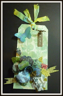
That sounded easy...except time, it's always time that messes me up. Even though there is A LOT happening on my tag, I love how it came to be.


  • The background colors were left overs on my craft sheets from Creative Chemistry Marbling with Stain....be still my heart, what a cool effect that is...even the left overs look good
  • the circles were the reverse of a Dyan Reaveley stencil with acrylic paint that I used on my 366 Calendar project for April
  • the big flower is the first flower I ever made like that thanks to Hel Sheridan's Sunday Stamper #197  a couple of weeks ago
  • the Tim Holtz Sizzix banner got cut out ... hmmm. Have no idea how long that's been floating around
  • the plaid butterfly was left over from a Grungy Monday #39 challenge to use alcohol inks
  • the leaves and small blue flower came from my stash
AND
  • I used the key and Muse stick because it appears this month, challenges were the key to my muse!!


Don't let the bee sting you! Enjoy.

ps I was too late this time...it was uploading to Simon Says Stamp when it closed, and their post was for tomorrow (it's 7:00 pm Alaska time). Oh well....I still like the tag!